|
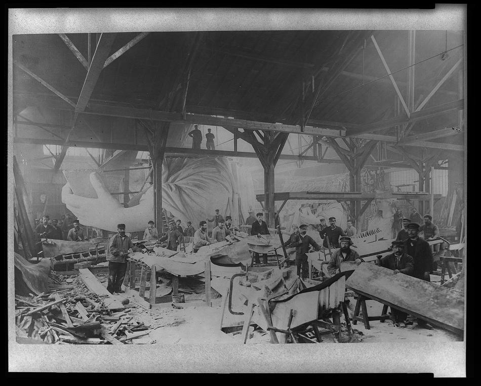
I saw this photograph whilst watching Robert Hughes' American Visions and he was talking about the Statue of Liberty. Loved the surreal vision of her arm scooping up the workers.
1 Comment
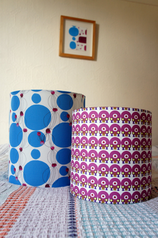
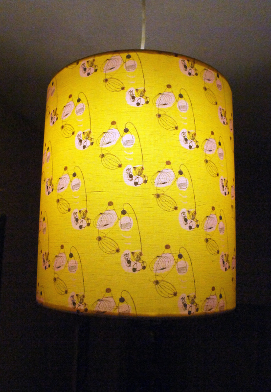
Here is a sneak preview of some of the shades I am making. I'm really pleased with the colours and the cotton linen has a lovely texture. In the background you can see the painting that inspired one of the first patterns I created from my 50's textiles inspired artwork. My interest has gone full cycle and it is incredibly satisfying to finally have my own fabric and potential products to share. The bottom shade is made with my 50's lamp fabric which I have also had printed onto a silk scarf which I was wearing yesterday when out to meet a friend. After examining it he picked out 3 different lamps from the design that he actually owns! He named each designer and told me where in his house each lamp was which was rather coincidental (I have never been to his house - it's in LA). I didn't even know which designers lamps I had recreated in my doodle. I recall the day I drew that motif, I was scanning a book on Fifties design, closed it and put pen to paper to see what happened. I didn't want to risk doing a direct copy, it was always supposed to be a loose interpretation but it seems I stuck pretty close to the original designs.
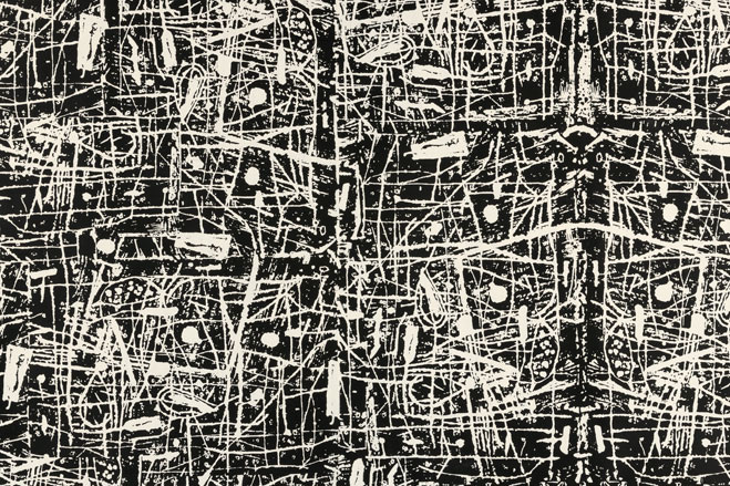
Last Saturday I took a trip out of London to see an exhibition at Firstsite Gallery in Colchester showing the work of Nigel Henderson and Eduardo Paolozzi, who collaborated to form Hammer Prints Ltd in 1954. Hammer Prints produced silk screened prints, wallpaper, ceramics and textiles. The two artists were also involved with the Independent Group at that time and went against the fashion of the 50's for the neo romantic revival of the country's rural heritage to produce strong distorted abstract expressionistic imagery. As they stated: "It is the object of Hammer Prints Ltd that an attack be made on the craft field using the silk-screen as the media to be exploited."
I was struck by the boldness of the work and the heavy application of ink. Most of the designs were black and white. They applied a lighter touch to the ceramics and some of the textiles, incorporating botanical and marine illustrations. It's really quite a contrast to the 50's style I am familiar with and they weren't commercially successful which is probably why I had never heard of their collaboration. The exhibition which is free runs until March 3rd. If you go at the weekend you'll no doubt also see a large group of emo teenagers hanging out there las they obviously have nowhere else to go in Colchester town (my sister said she saw them there a few weeks earlier too!). |
AuthorLover of pattern and colour. I create my own designs, products and paintings. Archives
October 2020
Categories
All
|


 RSS Feed
